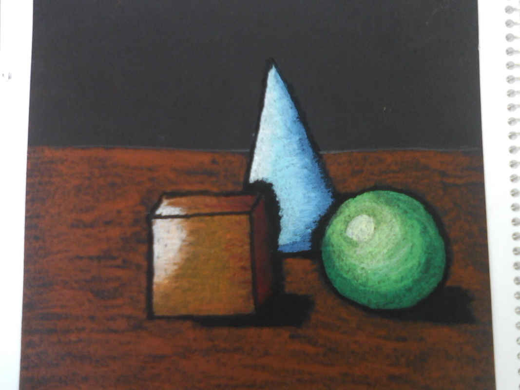
In this project I learned how to use oil pastels to create 3D shapes. I also learned how to overlap two colors to make the shading on the object look better. My experience with the oil pastels was really good. I like how bright it makes the picture look and if you do it correctly, make the object pop out even more than on pencil. I created value by having a shadow effect with the black oil pastel. Also using darker colors where the light is not shining on. Overlapping was important because it helped the shading look a lot better than having the colors stop and change. Yes, without showing a clear light source you wouldn't know where the light would come from and know where to shade. Value is important to show the shadow of the object and to show where the light it being directed at. Also it makes a 2D object turn into a 3D.
 RSS Feed
