Print Final
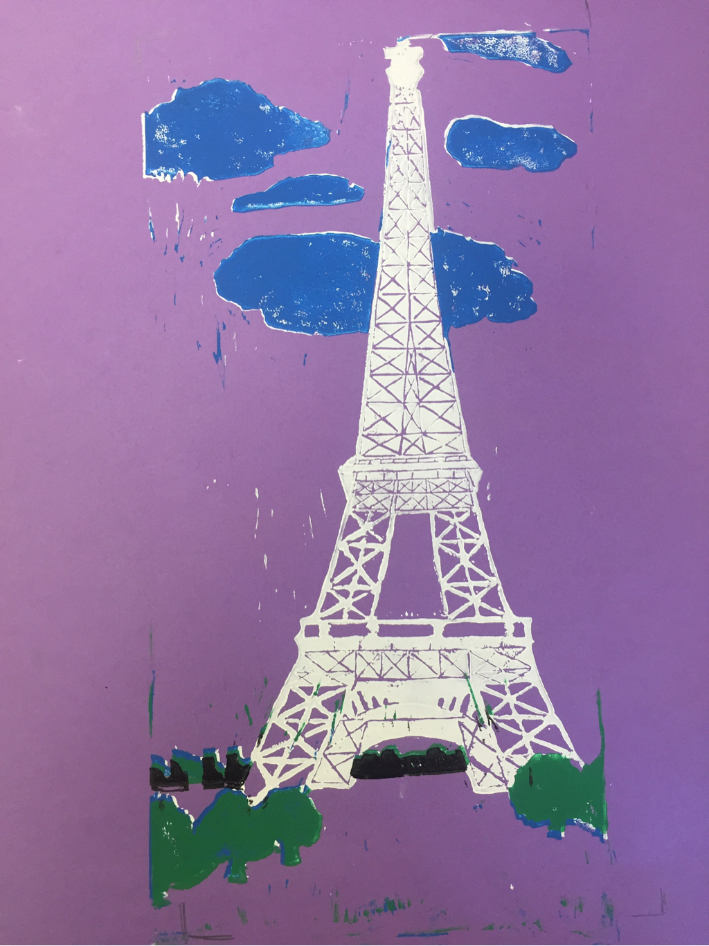
This is my Print Final. For this project we were assigned to choose either something in the prehistoric times, world historic buildings, or U.S. Historic buildings. I chose the Eiffel Tower. I chose it because I thought that it would be cool to have all the designs in the tower and the skyline behind it. Overall I think most of my prints came out well, and the colors I chose helped the tower and the other things I added pop.
Artist painting Project
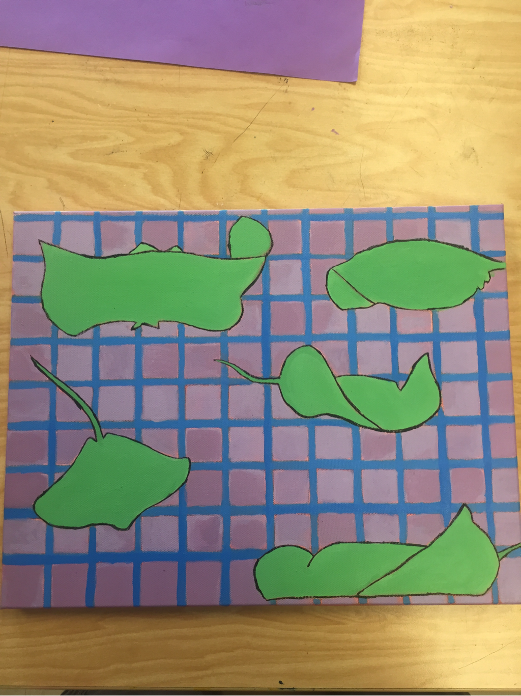
For this project we were given an artist, and we were suppose to do a research project, plus make a painting using their style of art. My artist was Victor Varsarely, who did optical illusion art. My painting is different sized and shaped stingrays swimming around. But for the optical illusion, I made the stingrays a mint green color, with a purple and blue background, making the stingray pop, but still having the lines and squares in the background. Overall I like how it turned out, but I took extremely long on the blue lines in the background of the painting. Even though this isn't finished yet, I still enjoy how it looks.
Clay food Final
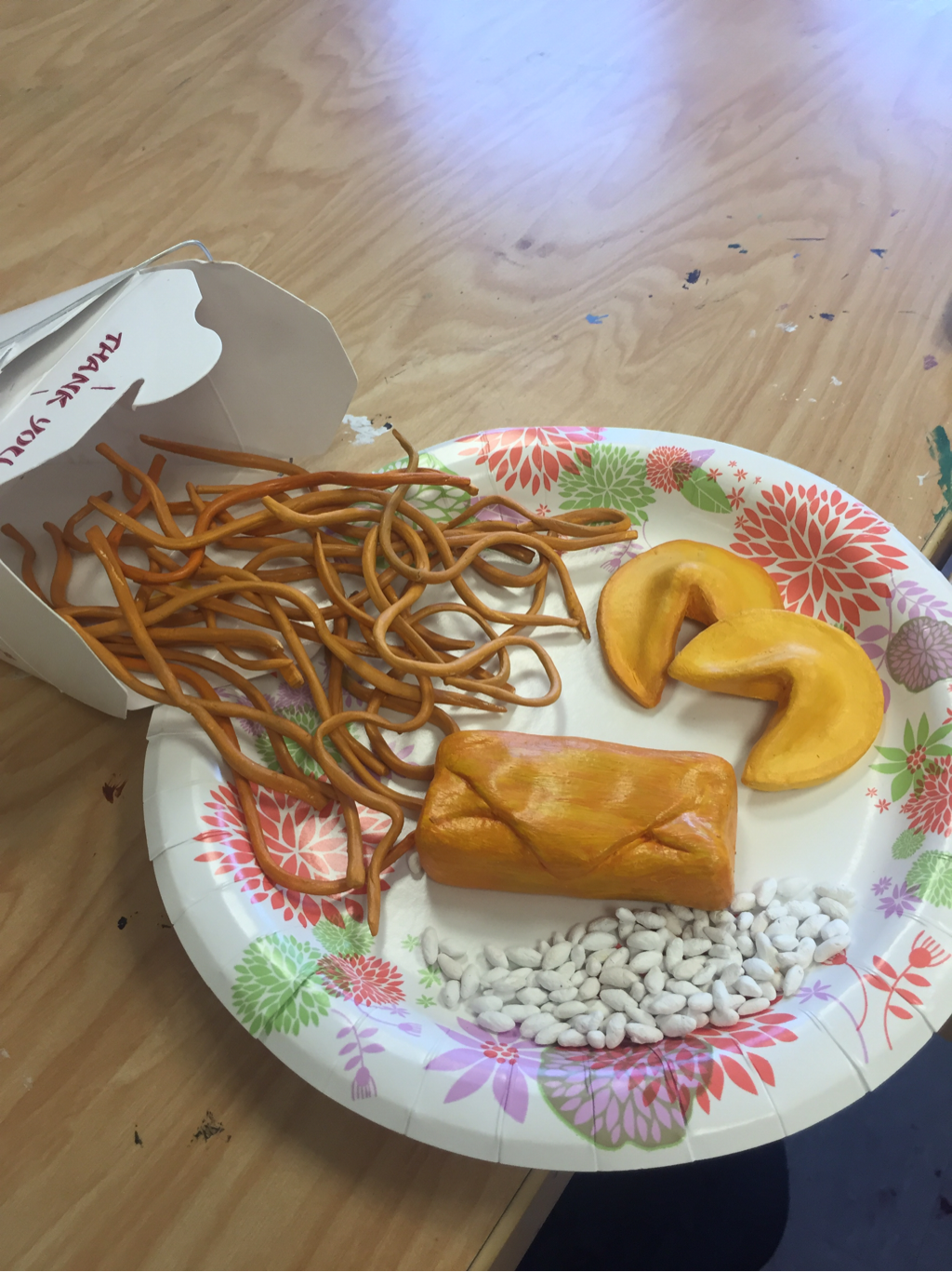
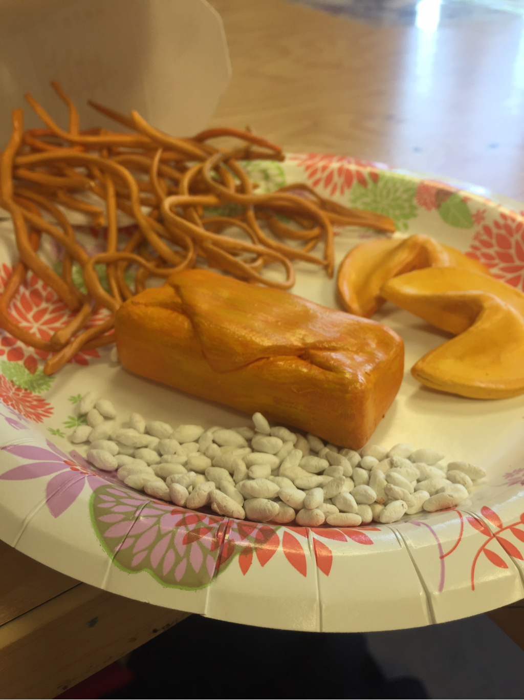
For the clay food project we were assigned to choose a food and make it as realistic as we can with clay and acrilic paint. My food was Chinese food (lo mein, fortune cookies, egg roll, and rice). Overall I think it came out fairly good. The colors of paint on my noodles could have been a little browner/darker and my eggroll could have been more circular. The hardest part about this project was probably the grains of rice. Having to shape them, paint them, and then put the polish on it, was tedious. But other than that I really like how it came out.
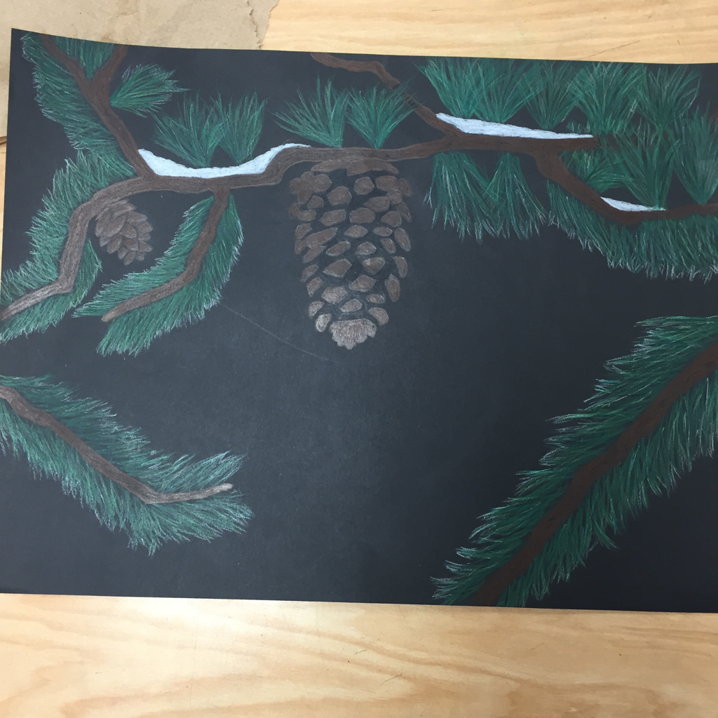
Up close Final
This is my final for the up close project. The reason why I chose to do a pine tree with pinecones was because I love the winter and pine trees are one of the big things that go in my mind when I think about winter. Looking at the final of this project, I think that it was well crafted but I could have added a lot more pinecones and branches to get rid of some of the open spots. I also liked my use of texture with the different greens and white on the pine needles and the Browns on the pinecones. Overall I think this project was pretty good, but I could have made it better by adding more things to make it less empty and more detailed.
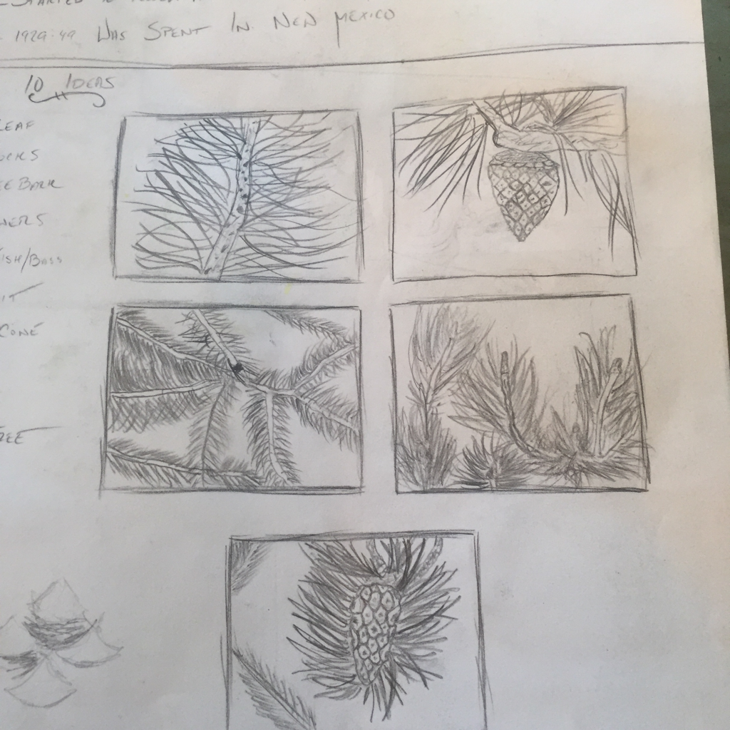
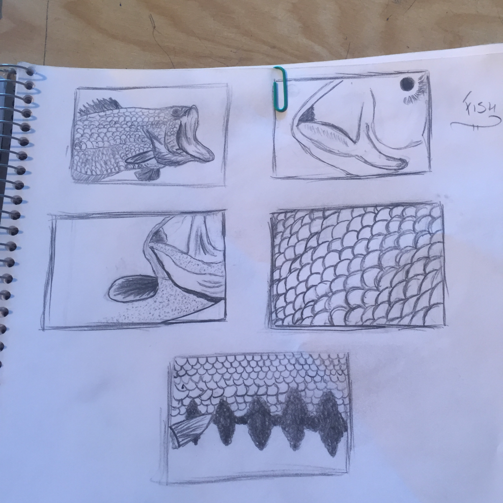
Up close
Scetches
These are my up close scetches for my up close project. I went for a fish (bass) scales and a pine tree with pinecones. I decided to go with the pine tree because I thought it would look better with the prisma colored pencils.
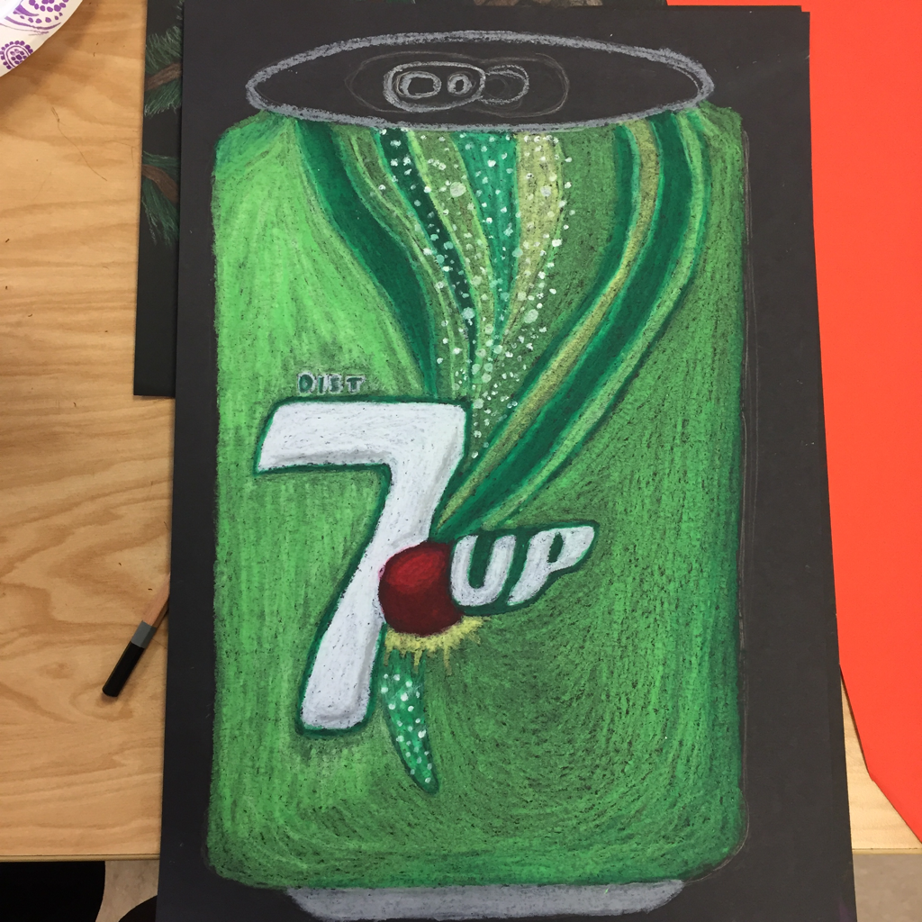
Oil pastel Soda Can
For this practice we were to make a still life of a soda can we were given to. Having to make this at such a large scale, really helped me decide if I wanted to use this for my final or not. I do enjoy the feel of oil pastel and how you can blend them easily, but I didn't think it would have been good for my final idea.
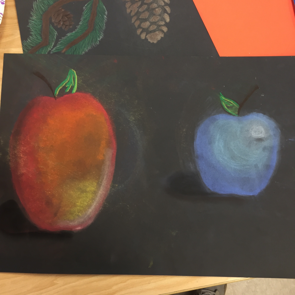
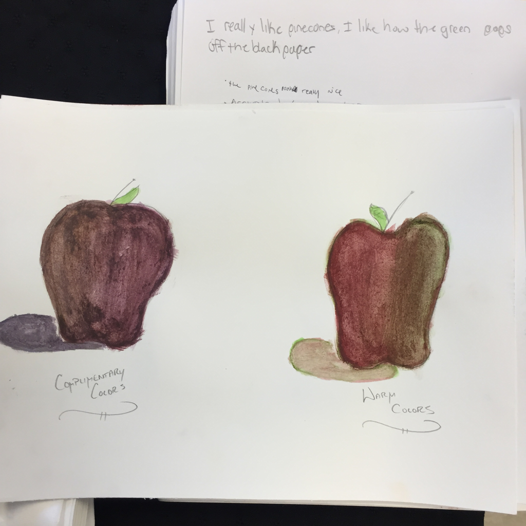
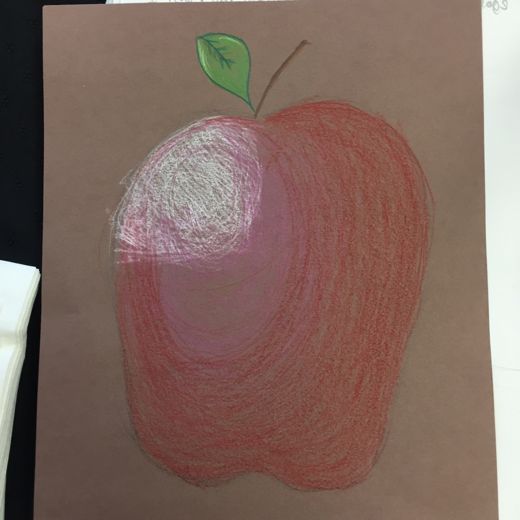
Chalk, Watercolor, & Colored pencil Apples
This is my chalk, watercolor, and colored pencil apples we made to practice and decide which one we would use for our final project. Doing these helped me get a feel of what I like and which one I should choose. The one I enjoyed the most was the chalk, and the least I enjoyed was the watercolor. But for my final I decided to to go for colored pencil.
Value chart and shapes
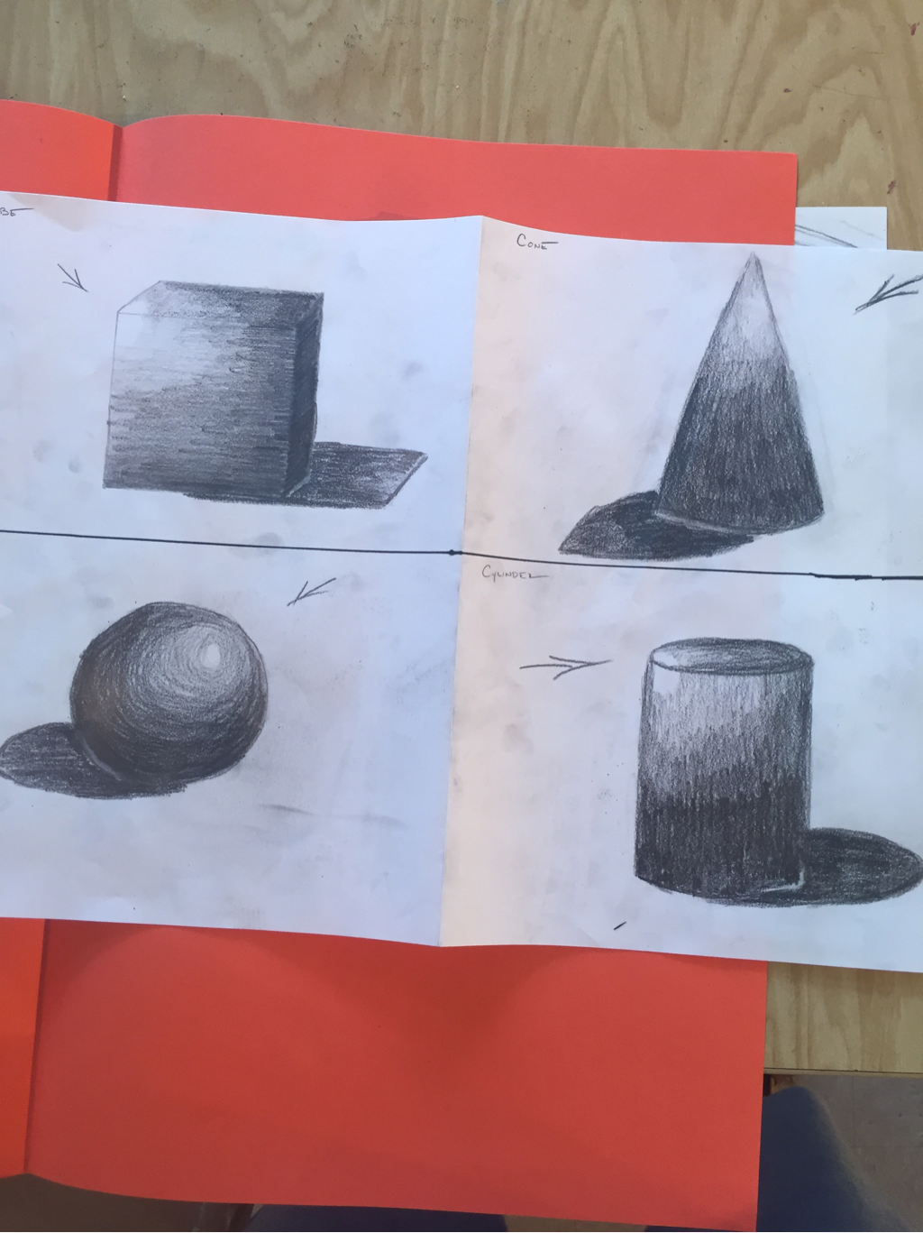
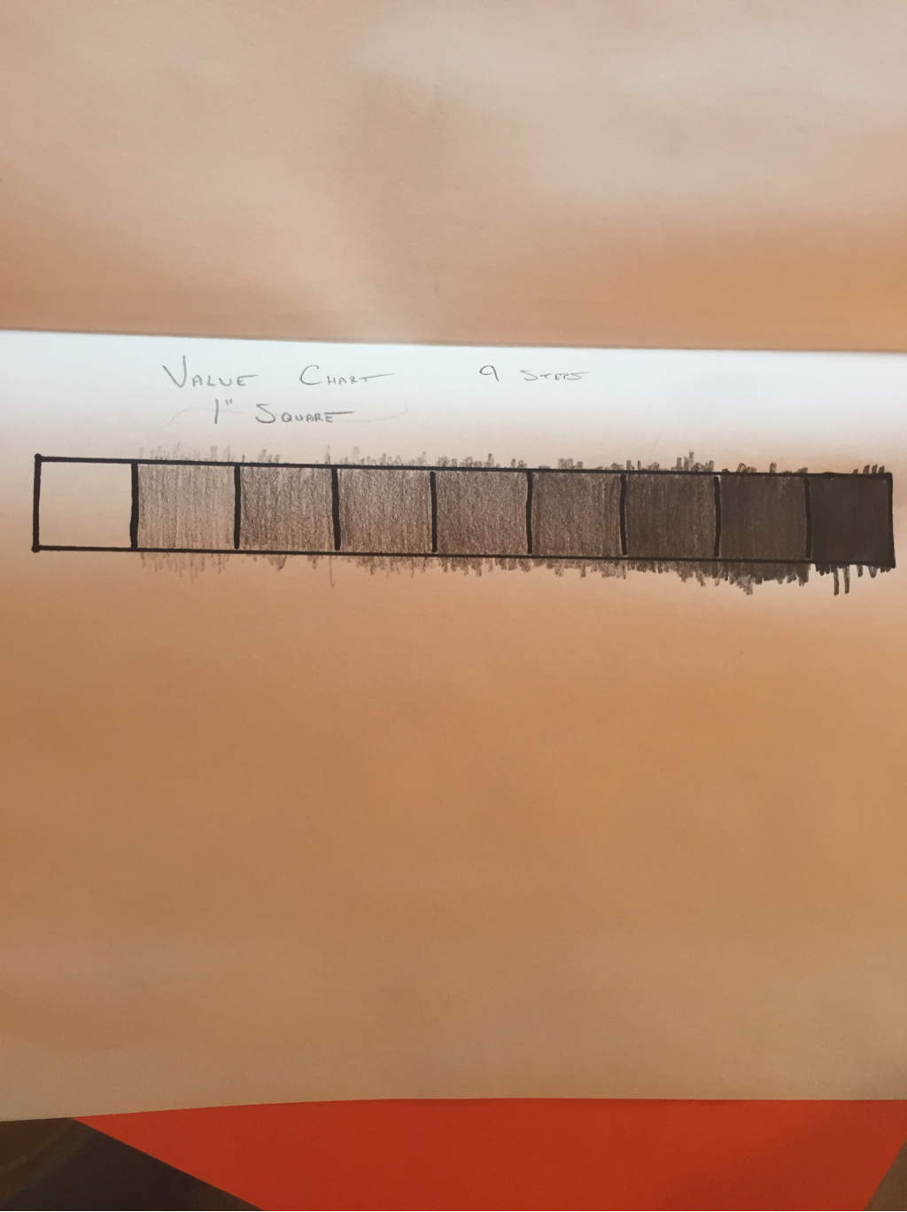
This is my value shapes and chart. We were told to do the chart and shapes to get a better feeling of value and how to do it. For the value chart it shows the nine shades of value. And for the shapes it helped us learn how to use the shades correctly and when to use the different shades.
Perspective scetches
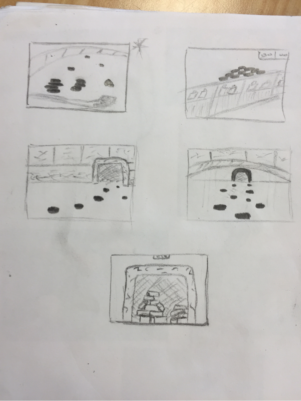
These are my scetches and final scetch for my perspective project. For this project we learned how to put things into perspective and how to shade with perspective. My 5 scetches are a mix of pictures I've taken and found online to create my final scetch.
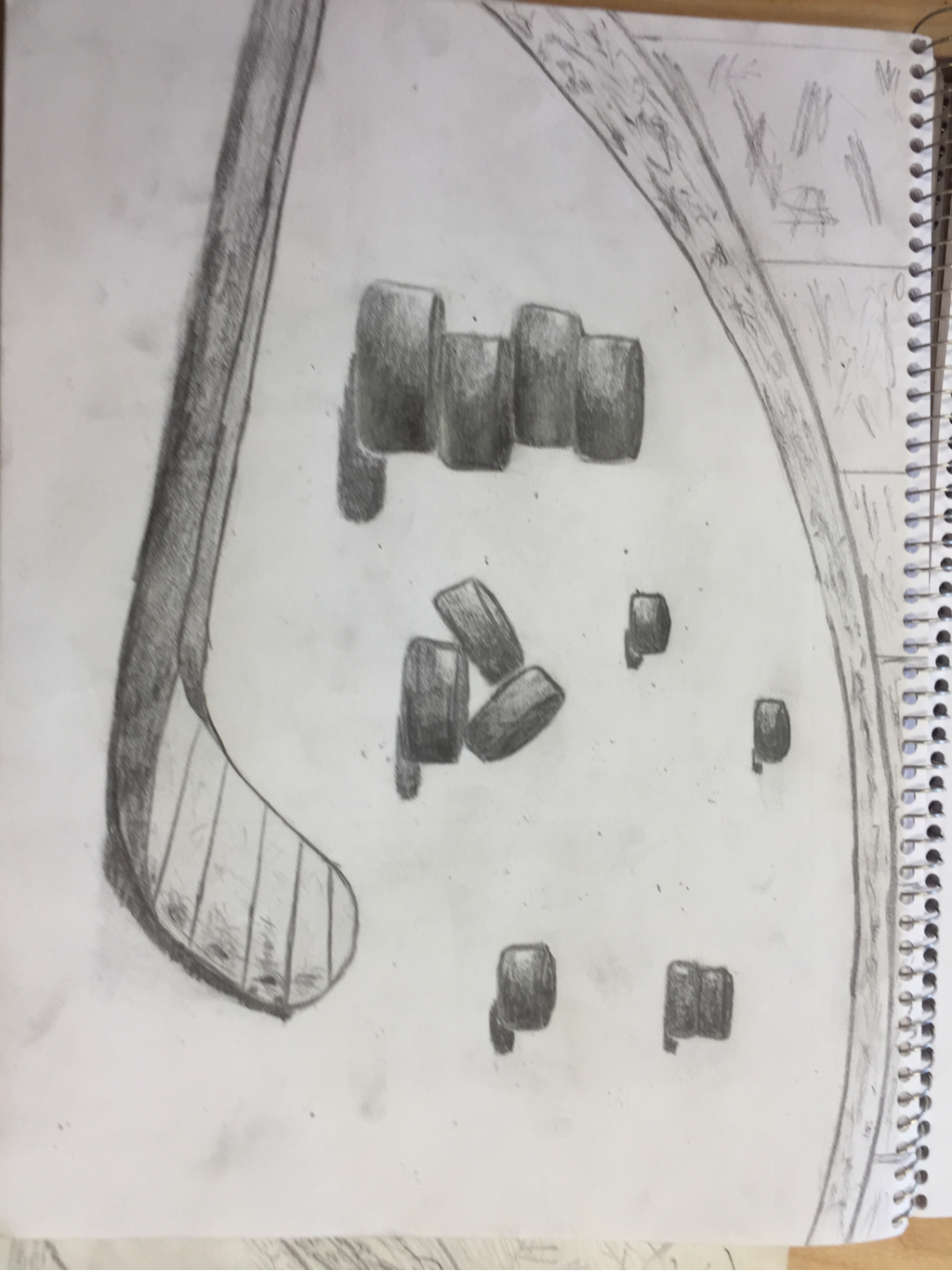
Pespective Project
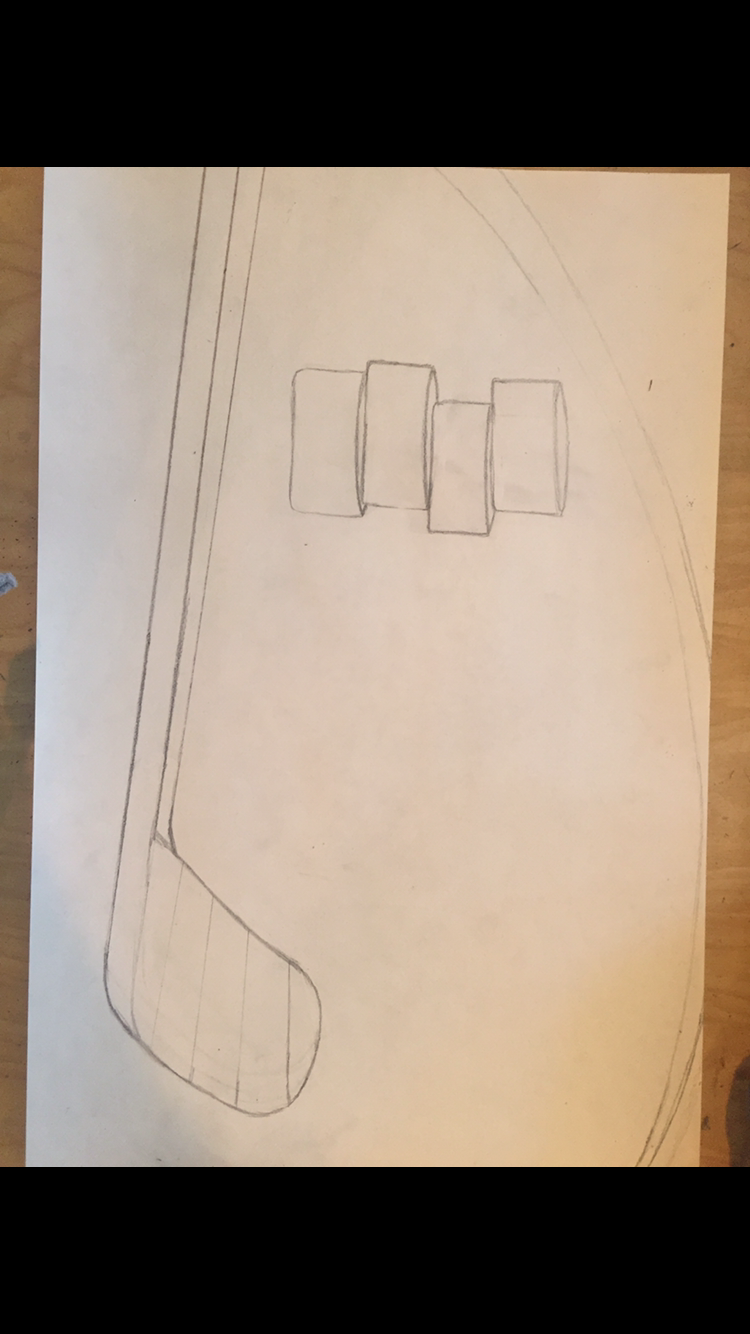
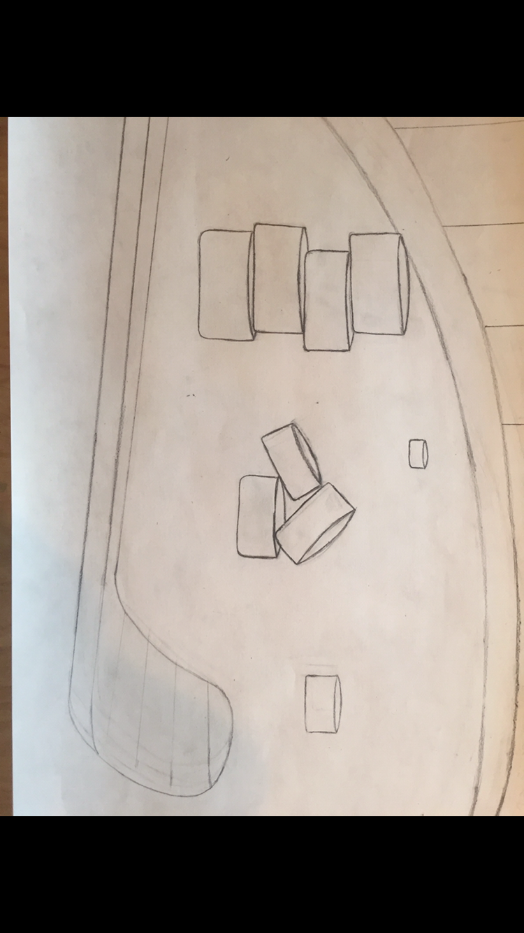
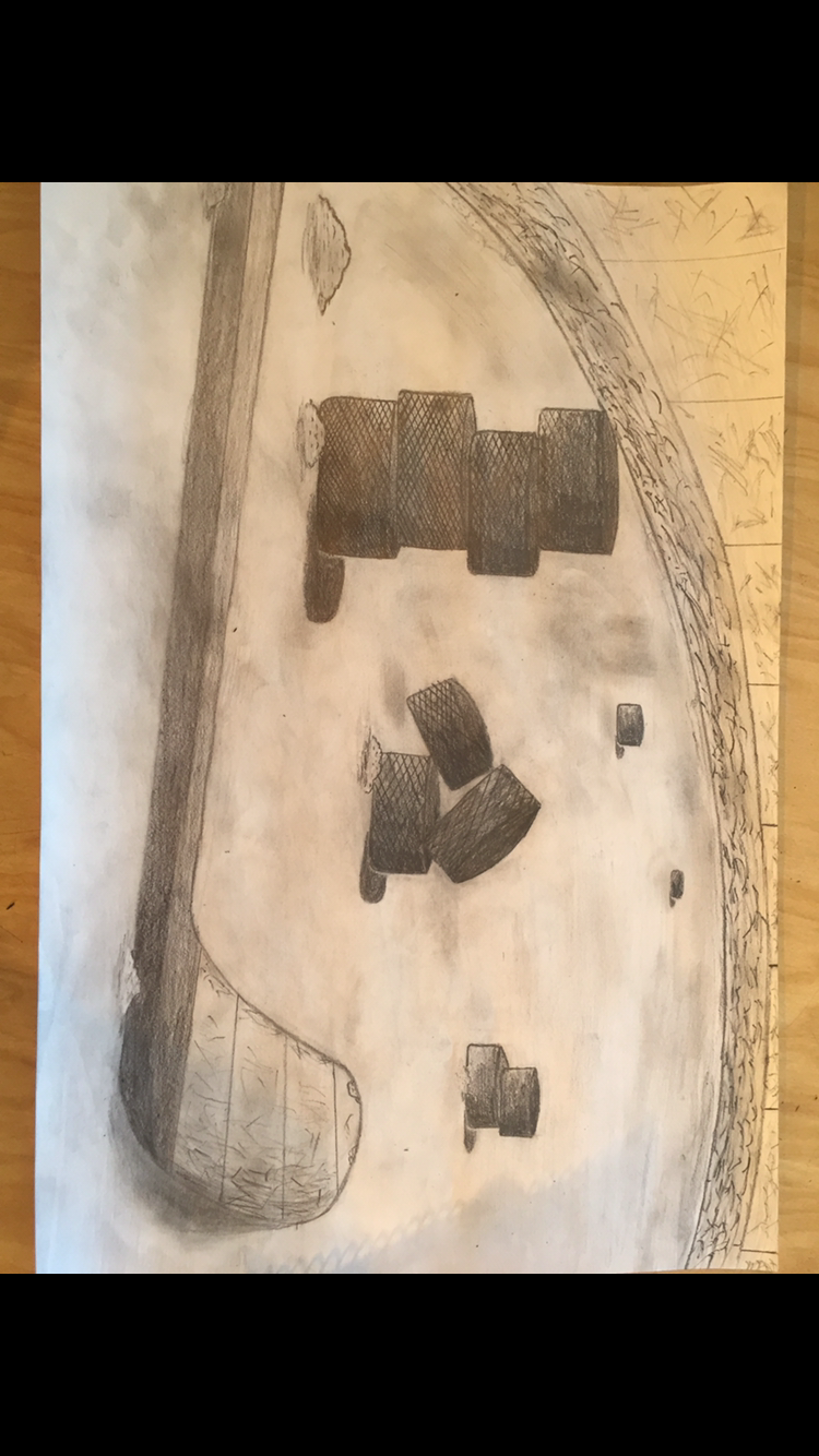
This is my perspective project final. I made hockey pucks going into perspective on a hockey rink, with a stick in front of all the pucks. I learned how to make objects go into perspective in a bigger format with all the pucks and the stick in front. I also then used my shading and texture ability to add detail to the pucks and where the light source is.

